Joshua Tree Music Festival Rebrand

Joshua Tree Music Festival Rebrand

Joshua Tree Music Festival Rebrand

Graphic Design | Branding | Environmental Graphic Design

Studio project conceptualizing a rebrand for a desert music festival to further connect to core festival values. Branding expanded upon with relevant print, digital, and experiential touch points.

The Problem

Joshua Tree Music Festival, held annually at the world-renowned National Park, celebrates music, art, movement, and community. The current identity fails to represent these values and is scattered and inconsistent across mediums. The project offered the opportunity to create a system rooted in the festival’s core values while translating it into a unified brand presence through various relevant touchpoints.

Refreshed Brand Identity

Initial iterations designed in Illustrator and then refined to create 3 distinct brand directions, focusing on aspects of the club like confidence and girlhood.

Initial iterations designed in Illustrator and then refined to create 3 distinct brand directions, focusing on aspects like confidence and girlhood.

Inspiration drew from holistic symbols to highlight the festival’s roots in more than just music. The mood board celebrated the intersection of community and desert landscape, emphasizing organic forms and imagery tied to the national park.

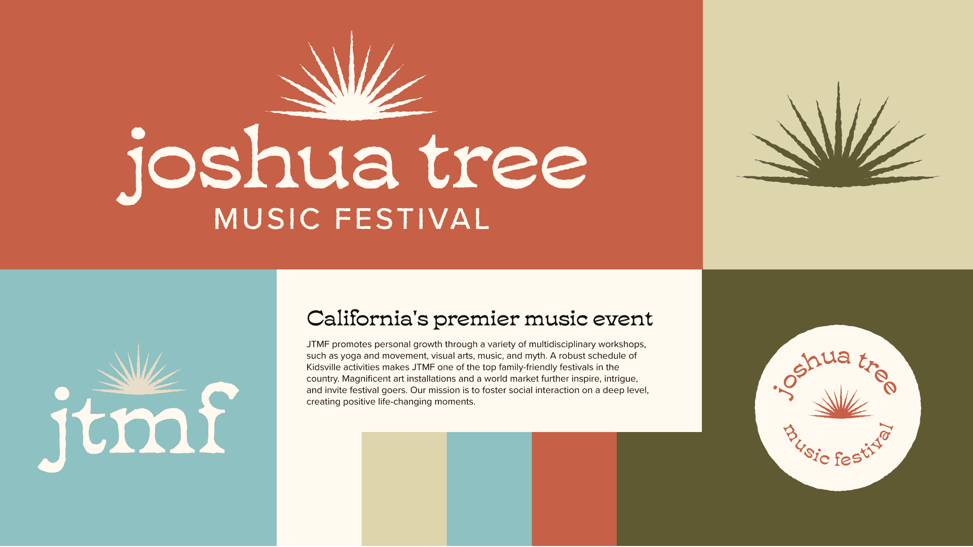
Branding concepts pushed the balance between natural and modern elements, leading to 3 directions for the identity.

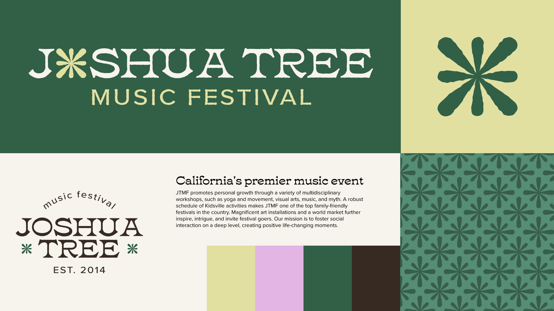
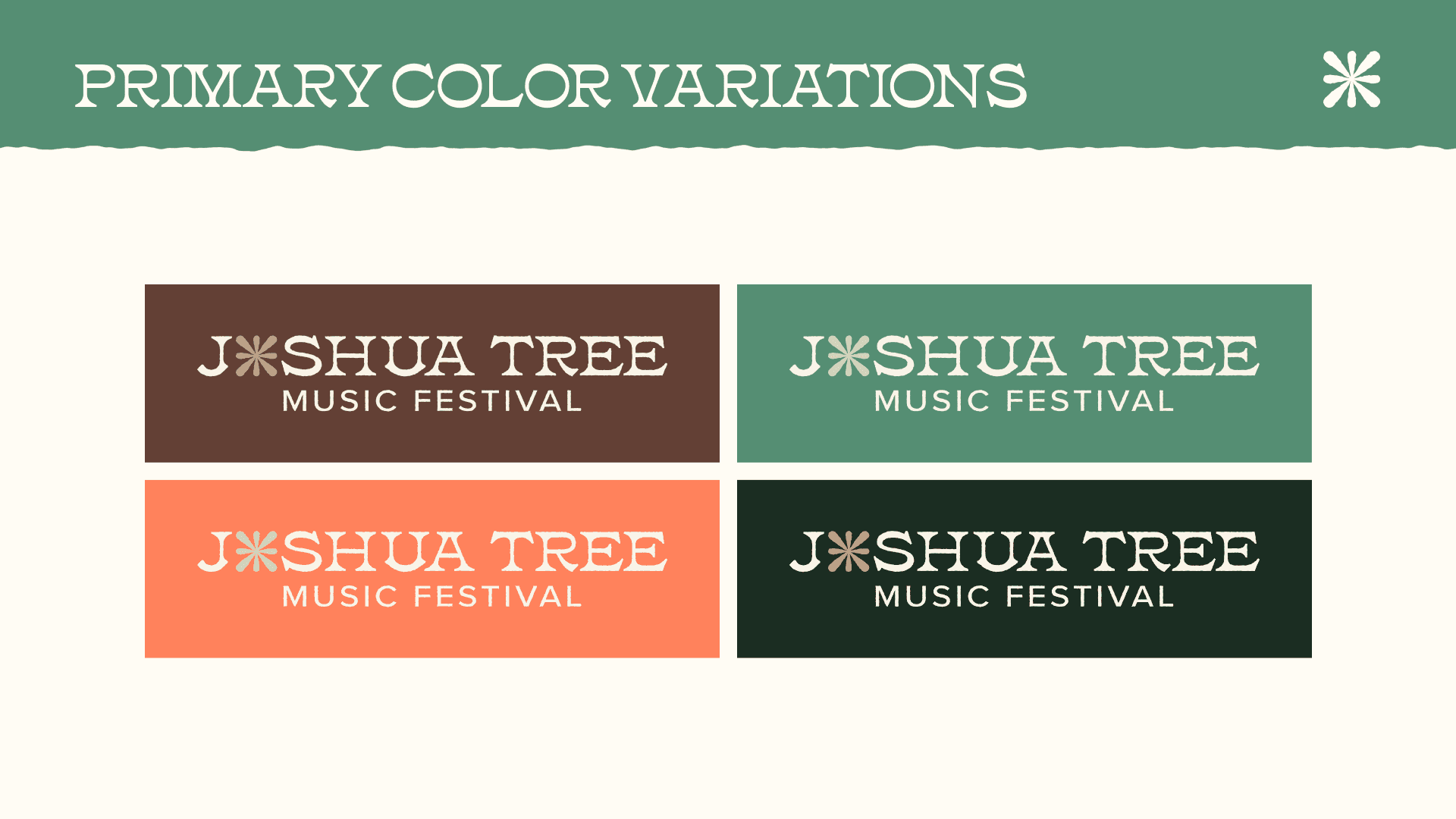
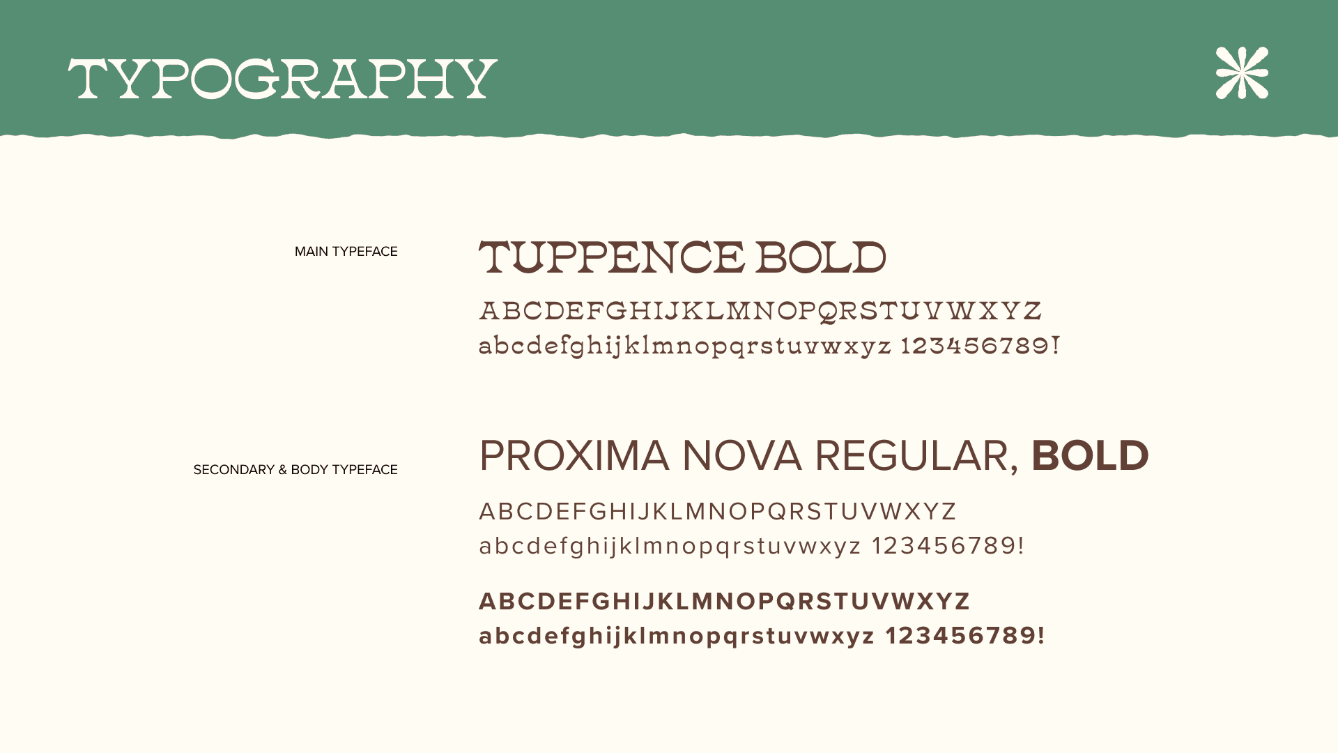
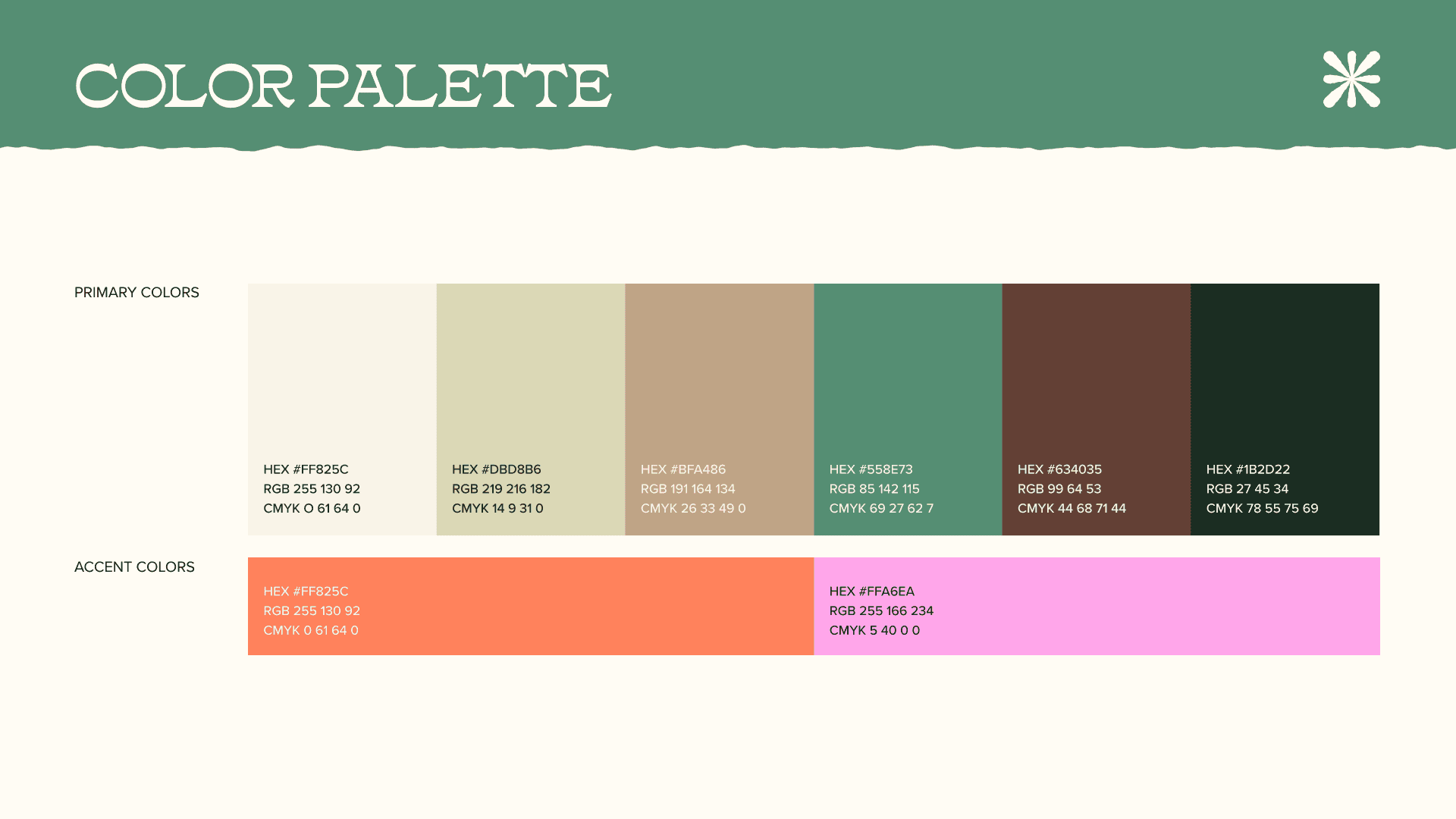
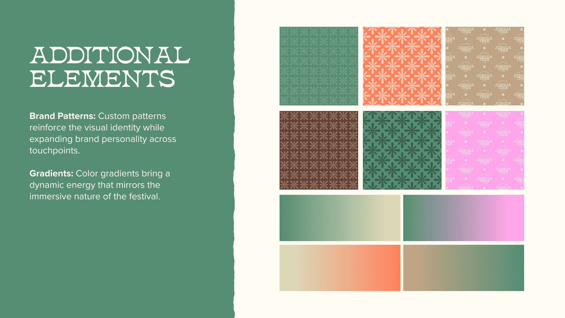
Refreshed identity aligns with natural desert atmosphere, and the abstract sunburst mark represents the various festival elements, expanded upon with alternate logos, typography, and patterns

Refreshed identity aligns with natural desert atmosphere, and the abstract sunburst mark represents the various festival elements, expanded upon with alternate logos, typography, and patterns

Refreshed identity aligns with natural desert atmosphere, and the abstract sunburst mark represents the various festival elements, expanded upon with alternate logos, typography, and patterns.

Branding concepts pushed the balance between natural and modern elements, leading to 3 directions for the identity.

Touchpoint Creation

Touchpoint Creation

Creation of 3 touchpoints (small, medium, and large) that are appropriate to the festival's audience and add to the experience.

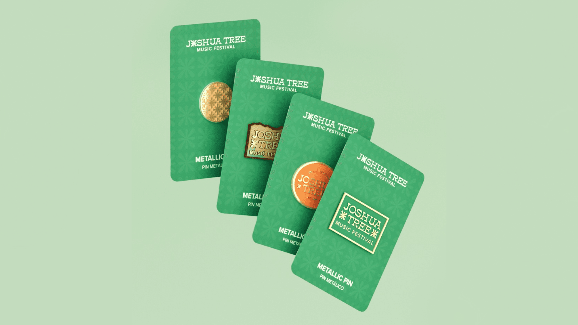
Stickers and pins as the small touchpoint serves as branded mementos, drawing inspiration from national park badges to celebrate the festival’s identity.

Pin designs mocked up in Cinema 4D.

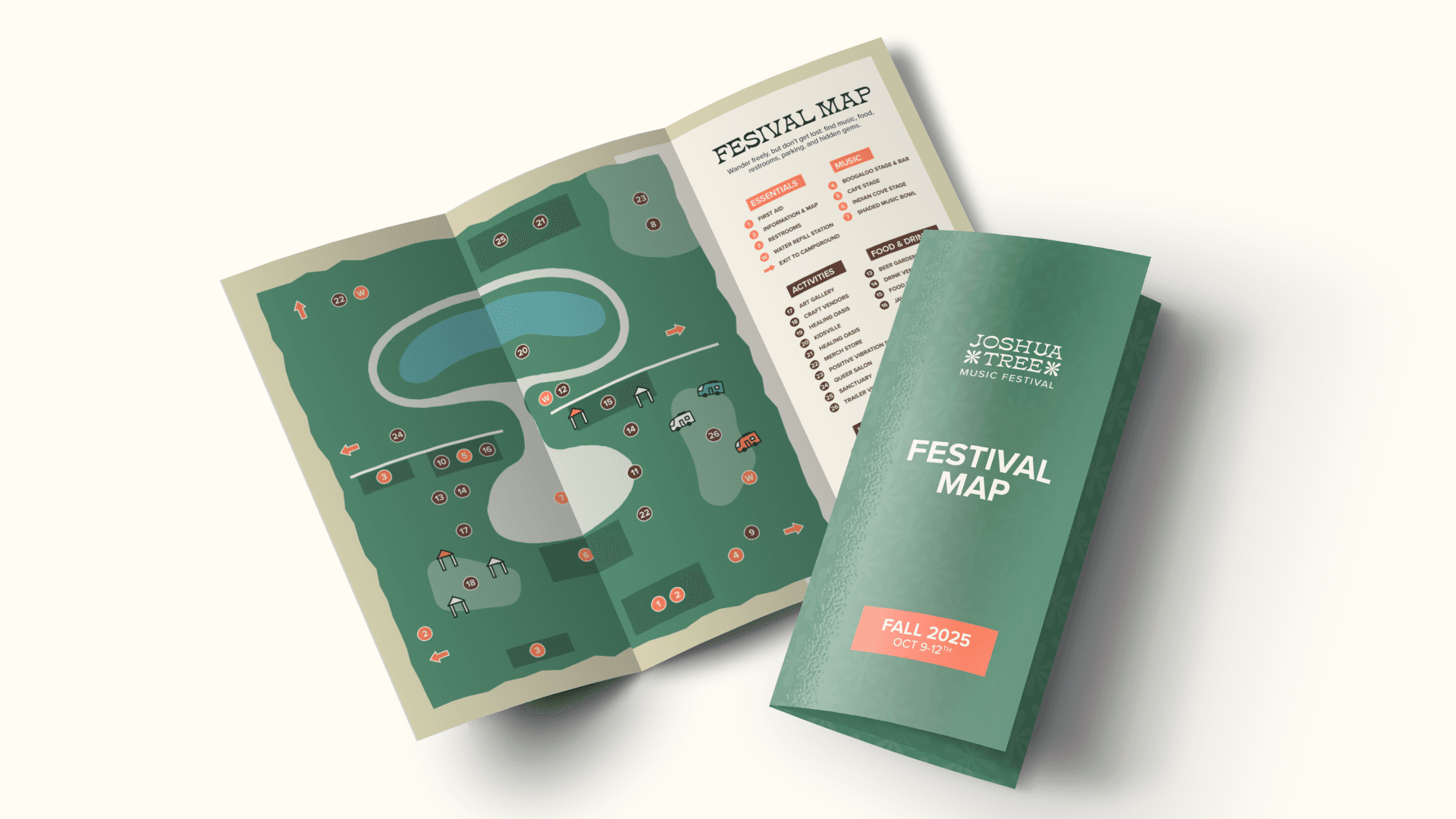
Handheld pamphlet map created as medium touchpoint for easy festival navigation.

Handheld pamphlet map created as medium touchpoint for easy festival navigation.

Large map display created to complement handheld map design, offering a clear source of information upon entering the festival. Built from sustainable materials, it also features a holder of smaller pamphlets.

Large map display created to complement handheld map design, offering a clear source of information upon entering the festival. Built from sustainable materials, it also features a holder of smaller pamphlets.

Stickers and pins as the small touchpoint serves as branded mementos, drawing inspiration from national park badges to celebrate the festival’s identity.

Handheld pamphlet map created as medium touchpoint for easy festival navigation.

harrisom@mail.uc.edu | (513) 808 1748 |

harrisom@mail.uc.edu

(513) 808 1748

harrisom@mail.uc.edu | (513) 808 1748 |

harrisom@mail.uc.edu | (513) 808 1748 |